Ten years ago, nobody could have predicted just how far front-end development would come. CSS was used to style elements on a page, but complex tasks such as animations and transformations had to be handled with JavaScript or the popular jQuery framework. Fast forward to the present day and, thanks to advancements in web development, there are now many more options available. One such example is the use of 3D animation from https://www.fuseanimation.com/3d-animation-studio/ site which offers a wealth of services, from 3D character modeling to motion graphics, to enable developers to create stunning 3D animations for web and mobile applications.
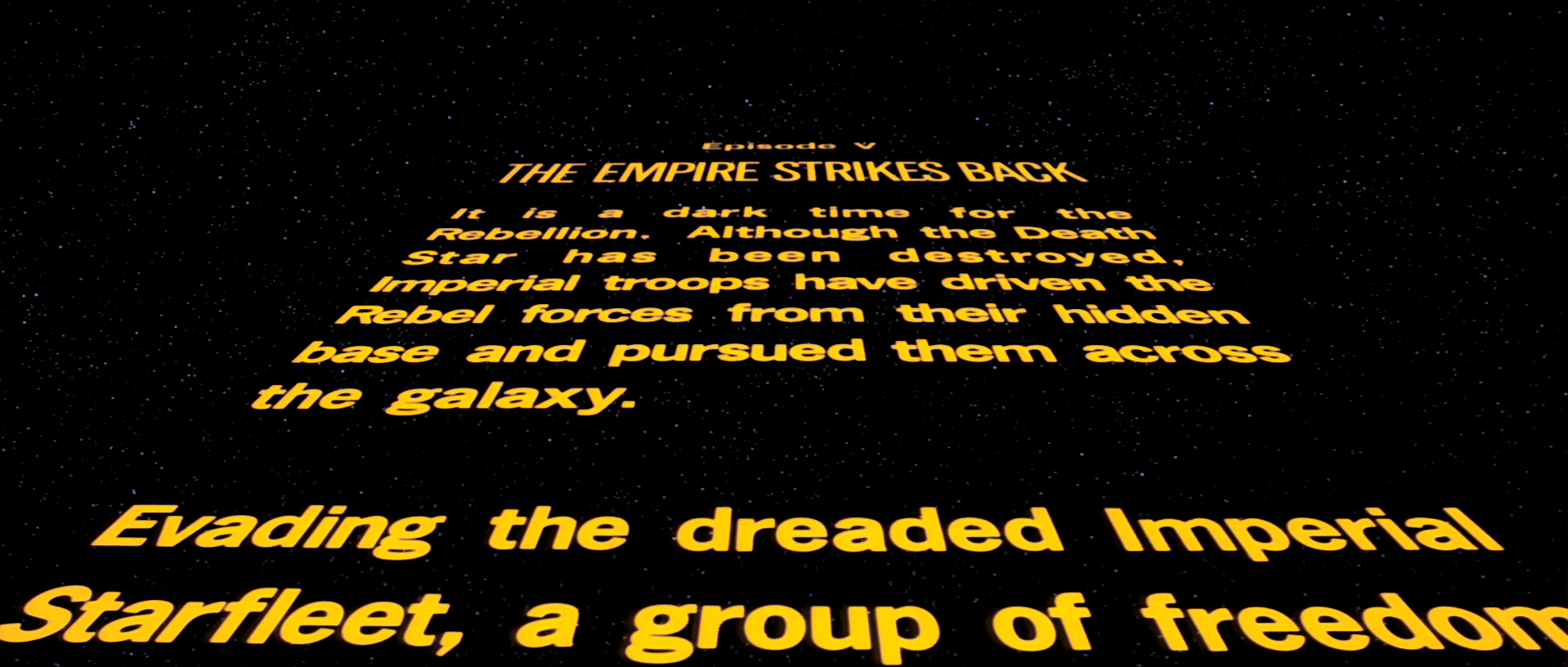
Currently, with CSS 3, HTML 5 and tons of Javascript frameworks for every possible use, we are in a totally different programming world. CSS has immense ecosystem of styles, which help us create, color, filter, transform or even animate objects on a screen. In this article I want to show a simple way to create animated Star Wars opening crawl using only HTML and CSS. There are a couple of methods to achieve this goal but we will try to choose the one that has the best performance. You may ask: “Why Star Wars opening crawl? There are so many interesting topics to choose from.” Yeah, it’s true but this task is relatively easy to implement and, what is more important, we need the most important CSS styles for animations and transformations to achieve it. And I love Star Wars.
1. Setup
At first, we have to prepare HTML and basic CSS for displaying opening crawl. The only thing we need in HTML body is this simple piece of code:
<p>Here put your opening crawl story</p>
Now we need to apply basic styles to the background of our scene and to the crawl’s content. Original Star Wars crawl contains blackish background and yellow text sliding on a screen. This can be done simply by adding this CSS code:
body { background: #111; }

p {
 margin: 0 auto;
 color: #fcd000;
 font-size: 30px;
 font-weight: bold;
 width: 600px;
}
Nothing special – just yellow text on a black background, you probably did it in your primary school. Fortunately, now we are going to use all the magic of CSS to make it ride.
2. Transformations
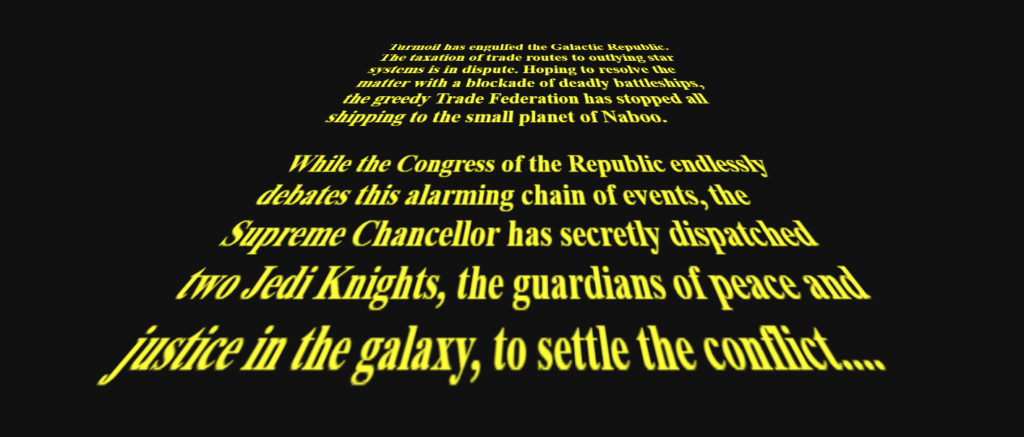
As you can see on the featured photo, our text must be leaned. To make it work we need one simple but very powerful style – transform. It prpvides us a lot of transformation functions but the most important are these, which are connected with translation, rotation and scaling. Currently, on most browsers we can use it in 3 dimensions (x, y, z).
In our case try to imagine that you put our <p> text into XYZ plot. We want to lean this text forward, in mathematical words, rotate around X axis.
And this is also pretty easy to do with CSS – just add this chunk of code to <p>:
transform: rotateX(30deg)
If you try to write the code along with me, you can see that this is certainly not what we expected. It looks more like shrinking than rotating with perspective. Why? The keyword here is the perspective. We didn’t declare this perspective, so browser did it for us and set perspective to none. As a result, there isn’t any visible perspective. How can we declare a perspective? There are two methods which are a little bit different. We can attach perspective to the transformed object or a parent of this object. In that case there is no difference but it’s extremely important to use the second approach if you want to transform more than one object. If you attach perspective to the parent, all children will belong to one perspective. And this is how it works in real life! On the other hand, you may find situations where “perspective per object” approach is better – mostly when you don’t need realistic behaviour but only nice looking effect.
In our task we will use parent’s perspective. To do this we have to put the code below into our styles (in our case these are <body> styles). For the sake of testing try this value:
perspective: 50px
I must be honest, for a long time (waaaaay too long) I was writing random pixels’ value into this property and checking if it’s correct. But inside, I’ve always wanted to understand what these pixels mean. Nowadays, my beard is thicker, I switched from tea to coffee and finally I understand perspective property, yay! MDN documentation explains, that this value is a distance between user’s eyes and z = 0 value on invisible plot. I will try to explain it more clearly. If you make perspective value very small, it looks like you are standing very close to the origin of object. Vice versa – if you provide really big value, you see an object from a really far distance. With this knowledge you can estimate what value you should type here. In our case our block of text is 600 pixels wide. We want to get the effect of seeing the crawl very close, so we should consider value, which is much lower than this 600 pixels. In our test we used 50 pixels but we can see that we “are standing” almost inside the block of text, so we should increase it to at least 150 pixels.
That should create a pretty nice effect of static Star Wars opening crawl.
body {
  background: #111;
  perspective: 200px;
}

p {
  font-size: 30px;
  color: #fcd000;
  font-weight: bold;
  width: 600px;
  margin: 0 auto;
  transform: rotateX(30deg);
}
3. Animation
We’ve got the text on a screen, it’s leaned as we wanted but we still need to make it move. At this moment we have to decide which way we choose – and this will result in how efficient our code will be. Practically, we have three significant methods to do this – 1. margin-top property, 2. position absolute/fixed with top property or 3. transform property using translate relative to Y axis.
Modifying margin is the worst choice. Seriously, never ever do that! Margin property was never created by browsers developers to use it in complex animations. Okay, in this simple example of one animated block of text, it’s possible that you won’t see any difference. But try to animate hundreds of objects on a screen with margin and you will see that you should forget about this method. And if you need just a simple animation it’s still not a good choice. Why would you use something worse if you have something better? Speaking about something better..
..top property. Certainly, it is a better option, but still not the best. In the current frontend world there are many popular applications which use top/left properties to animate movement on scrollbars, sliders or animated dropdowns. But these examples are relatively simple tasks for our powerful devices (don’t tell me your 2014 smartphone is not powerful, it is powerful enough). It has one advantage over next method – it’s more compatible so if you need an effect which works on older browsers maybe it’s better.
For complex visualizations or simple games using many animations you should always choose transform over margin or positioning. Browsers have different approaches to render DOM but mostly they use a different way to render elements transformed with transform property. For example, on Chrome, elements are taken into its own layer of GPU (RenderLayer), what causes frames to be drawn quicker. If you are interested in understanding it more precisely, try to make a simple animation with position absolute and check “Performance” section in Chrome Developer Tools. Then do the same with transform property. You will see differences in rendering times and GPU layers used to render it.
Okay, so we all agree that in that case transform is the best choice. We will stay with the transform property because it will be rendered on a separated GPU layer and we will create a crazy fast opening crawl animation. But you may ask: “Where is this animation mechanism?” Transform on its own just sets specific translation, rotation or scale, STATICALLY, nothing more. To make it move we need animation property – next fancy CSS feature. And this is quite tricky and complex feature. With animation property we can define duration, delay, name, iteration count, direction, even timing function of animation! But to simplify, we will leave most of these properties default. Without more ado, let’s make it moooove. Add this code into the <p> styles:
animation: animateCrawl 20s
We declared that this block will use animation called “animateCrawl” and it will take 20 seconds. But we still didn’t define this animation and to do this we need to fill our animation’s keyframes.
@keyframes animateCrawl {
 0% { transform: rotateX(30deg) translateY(400px); }
 100% { transform: rotateX(30deg) translateY(-300px); }
}
For those who don’t understand what does this syntax mean – first of all we need to enter keyframes expressed in percents. Then we define object’s styles in these moments. Animation mechanism will automagically interpolate the difference in time what causes the animation effect. In result, our block of text will move according to Y axis, from the bottom to the top.
If you are observant, you may see that I also added rotateX value into transform property, which was added before. At the beginning of my frontend adventure I was asking myself: “Why can’t I use only translation here if I want to animate only translation?“. Answer is simple – the consequence. CSS treats every style as a pair – property name and value. Transform is just a single property name, so if you want to make a few transformations, you must put them all into this transform style. If you type only translateY transformation, you will simply override previously added rotateX with a default value. Not very comfortable but we must accept what CSS gives us.
If you launched this animation, you may see a small problem – at the beginning the movement is really fast and it slows down after every frame. From physical perspective it is done properly but original Star Wars opening crawl was moving uniformly. To fix it we need to change animation timing function. It gives us a lot of freedom, we can even define our own cubic bezier function! To simplify we will use built-in timing function called “ease-in“. Mechanism of “ease-in” is pretty easy to understand – every frame animation is faster than frame before. And this is exactly what we need. Perspective gives an impression of slowing down, “ease-in” function accelerates in time so in result we get steady movement. Of course, if you want to make it very precisely, you should consider using custom cubic bezier function.
animation: animateCrawl 20s ease-in;
And it’s done. Star Wars opening crawl. Now you can use this knowledge for various CSS animations.
If you want to see working solution, check this codepen: https://codepen.io/Mossar/pen/rGpWqX


